Website Design
Does the thought of a website project give you the heebie-jeebies?
It’s okay to admit it.
There’s too much work, not enough content, and then all that techy talk of domains, URLs, SEO, and blogs makes you want to curl into a fetal position while listening to an old Abba album.
Take a deep breath, and relax those shaky I-need-nicotine hands. We’ve got you.
Think of us as your fearless website sherpas. Through all these years of climbing cyberspace mountains, we’ve discovered a truth:
Well-intentioned entrepreneurs are jacking up their websites.
They really don’t mean to.
But they’ve got a business to run, their hair’s on fire, Larry didn’t show up for his shift, and working on a website feels like only a slightly better option than having a colonoscopy.
And when these biz owners finally get around to fixing their website, they have little experience with what works. So they throw the kitchen sink at it...
Bells! Whistles! Video Carousels! Long Wordy Pages! Pictures of a beach sunset!
In the end, the website resembles a messy college bulletin board. It's like someone chucked spaghetti against the wall.
And for the potential customer, it’s a terrible experience. The core message is lost in the chaos, which then decreases leads and damages sales. Yep, the company takes a big, fat, “L".
Our website mission
We’re on a mission to save the world from hob-glob, goat rodeo, dumpster fire sites.
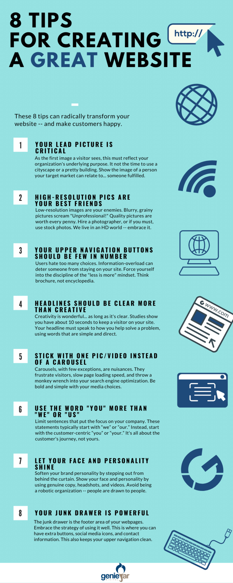
Our rallying cry is, “Great website lovers, unite!” Which really means your site must have a clear message, plenty of call-to-actions, and a strategic flow.
Here are the principles we use for every website design:


